
Integrating typography, editorial layouts, and hand-rendered drafts to build consistent visual systems across digital and physical work.







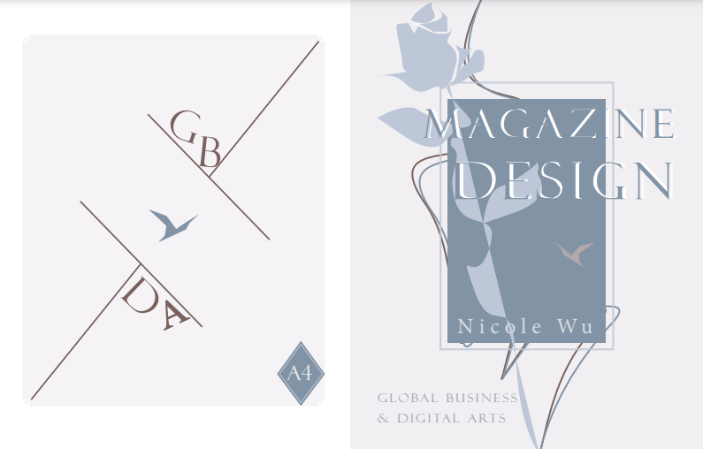
GBDA 201 - Editorial Layout Systems. An extensive exploration into print typography grid alignments and visual pacing metrics.
Balancing editorial density with whitespace margins to enhance reading rhythm across consecutive multi-column pages.
Editorial Designer: Structured typography scale, set baseline grid frameworks, and executed precise color plate testing.
Mastered modular grid systems, developing advanced control over margins, line lengths, and paragraph hierarchies.


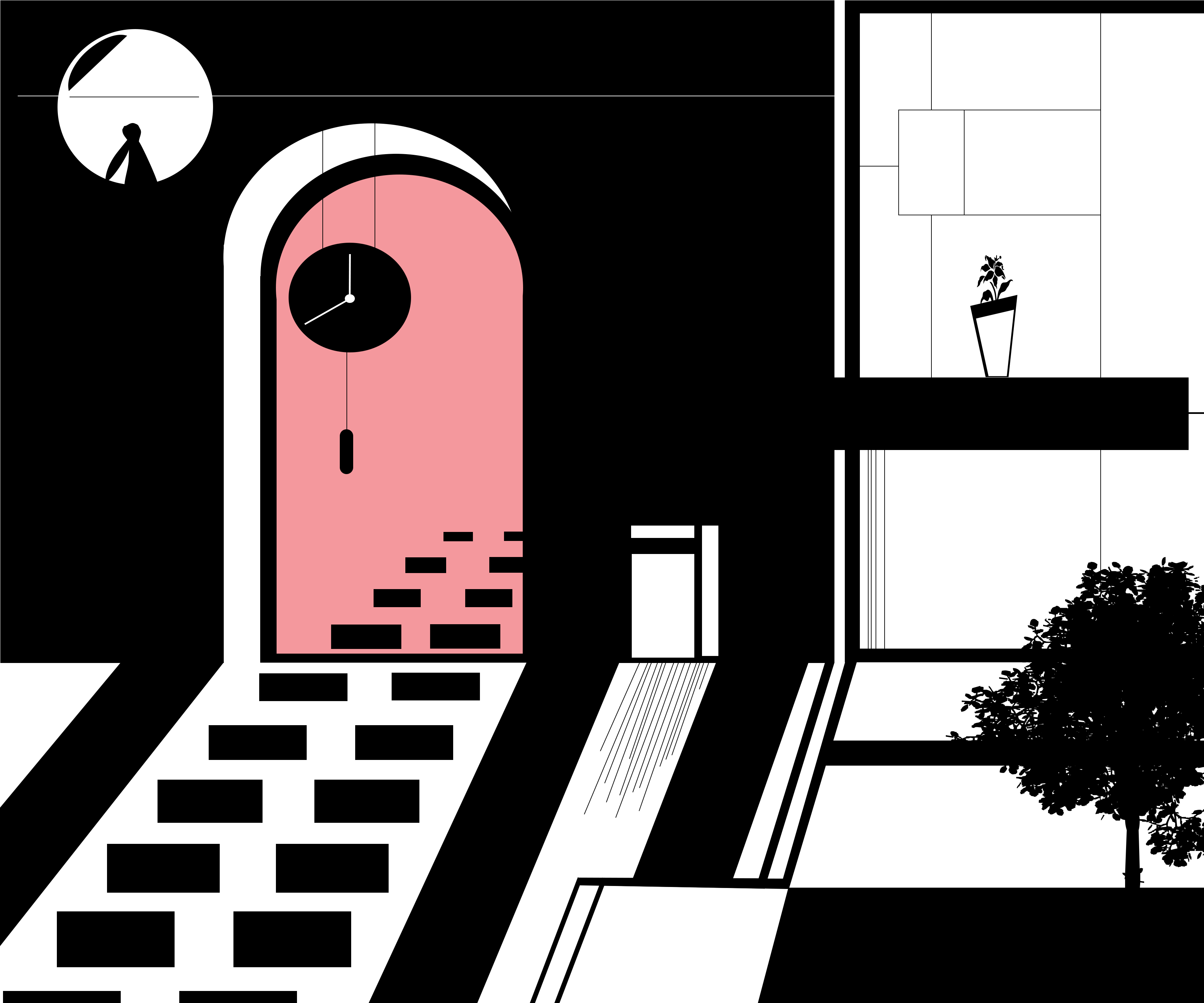
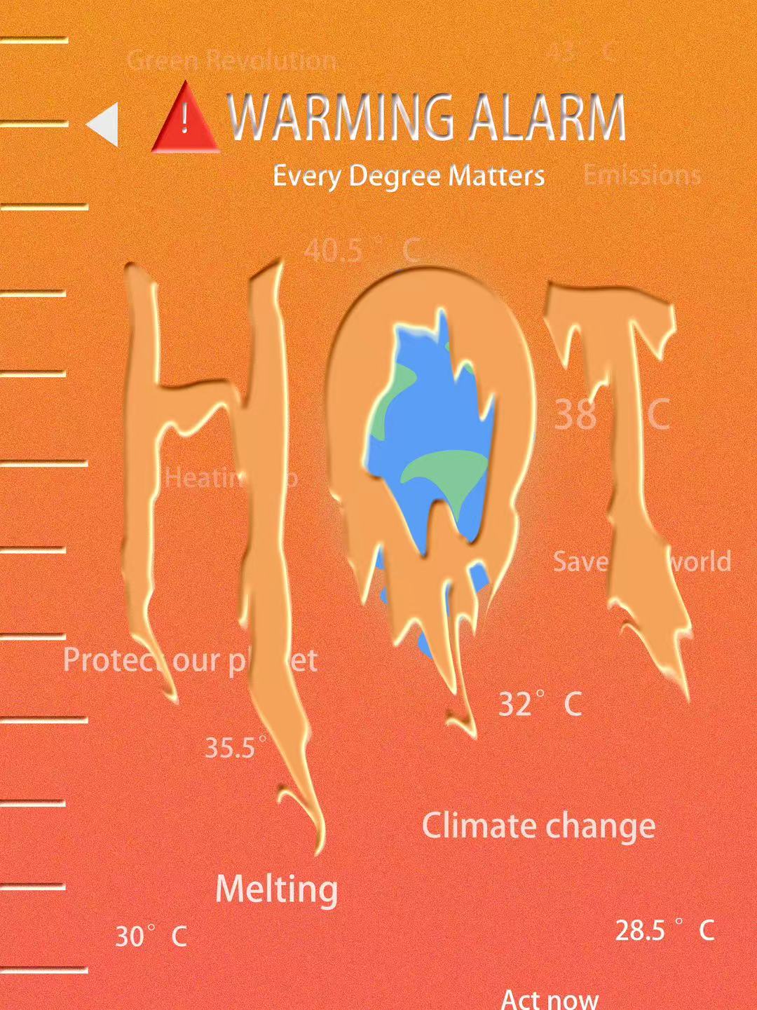
GBDA 201 - Digital Media Project 1. An experimental zine project combining poster aesthetics with nonlinear visual narratives.
Testing unconventional fluid layout systems while maintaining strict legibility cross-points across multi-panel print fold layers.
Full Production: Managed visual configuration, abstract digital illustration pipelines, and physical print output formatting.
Developed stronger control over translating digital designs into physical printed outputs.

Premier Protein's bold red rebranding stamp, integrating a powerful geometric typographic structure with a flexed bicep stroke to radiate athletic momentum and user lifestyle focus.
VIEW CASE STUDY →
SILKYO's sleek corporate identifier, highlighted by a continuous flowing lettermark mapping out premium textile motion to convey modern urban refinement.
VIEW CASE STUDY →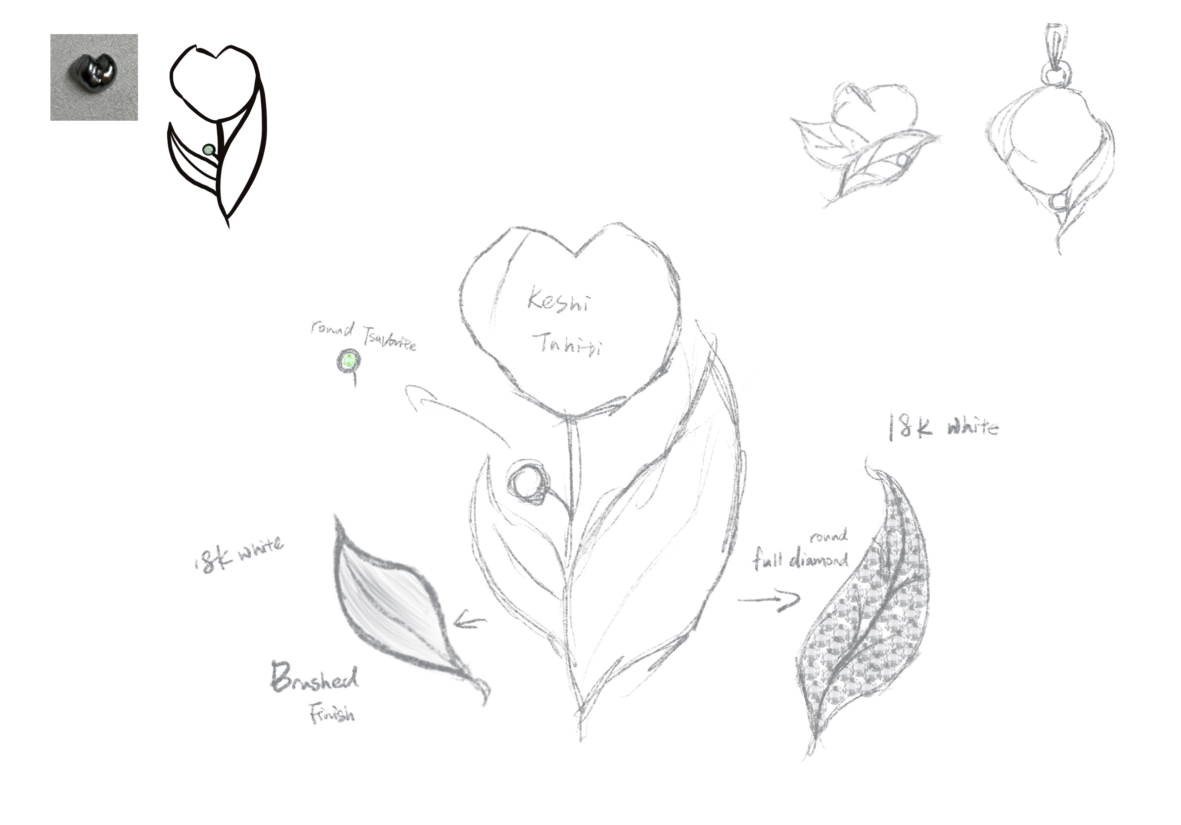
Initial hand-drawn concepts focusing on organic curves.
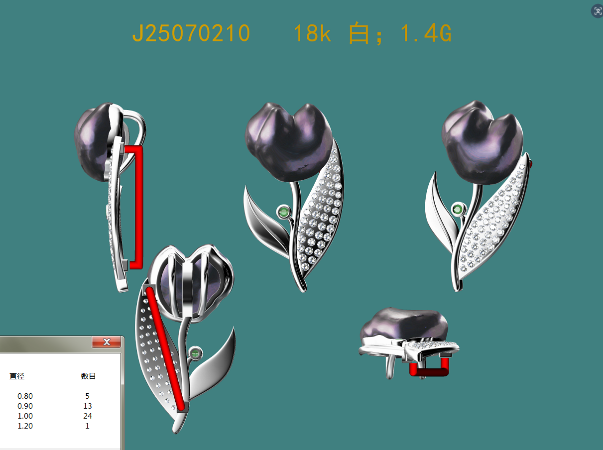
Technical 3D modeling for factory casting preparation.
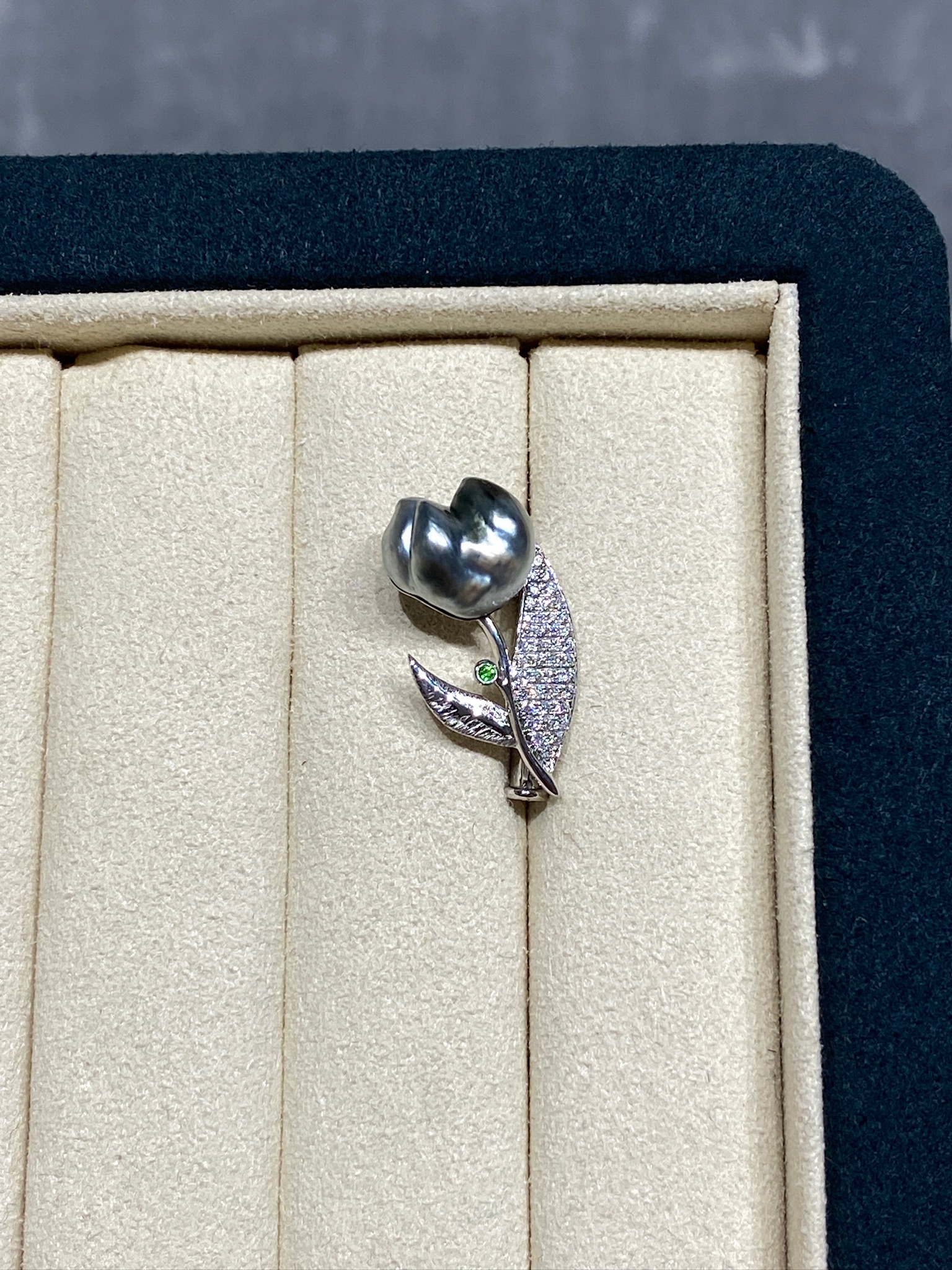
The physical manifestation of the original vision.
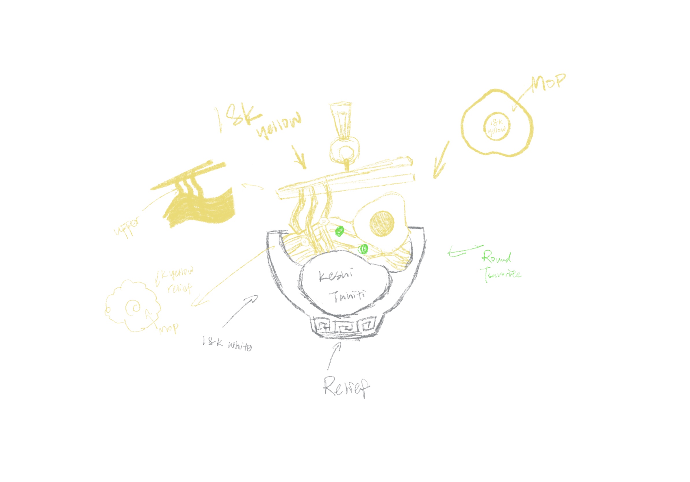
Initial hand-drawn concepts focusing on organic curves.
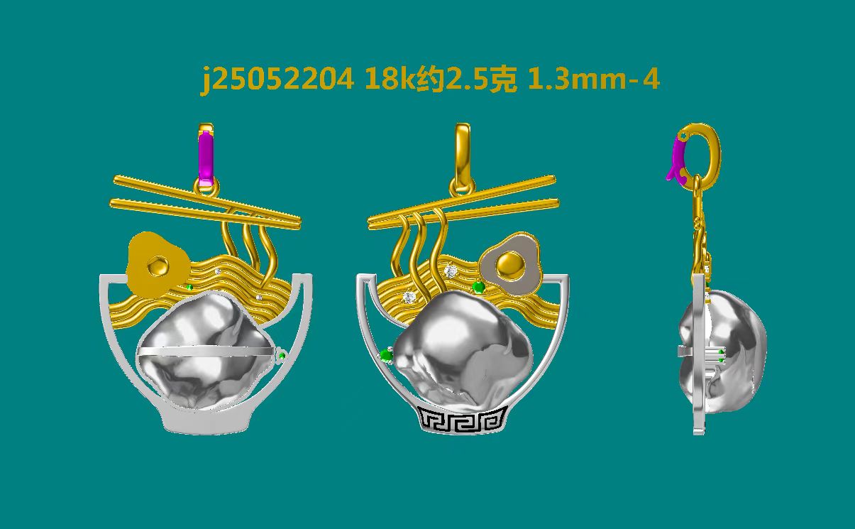
Technical 3D modeling for factory casting preparation.

The physical manifestation of the original vision.
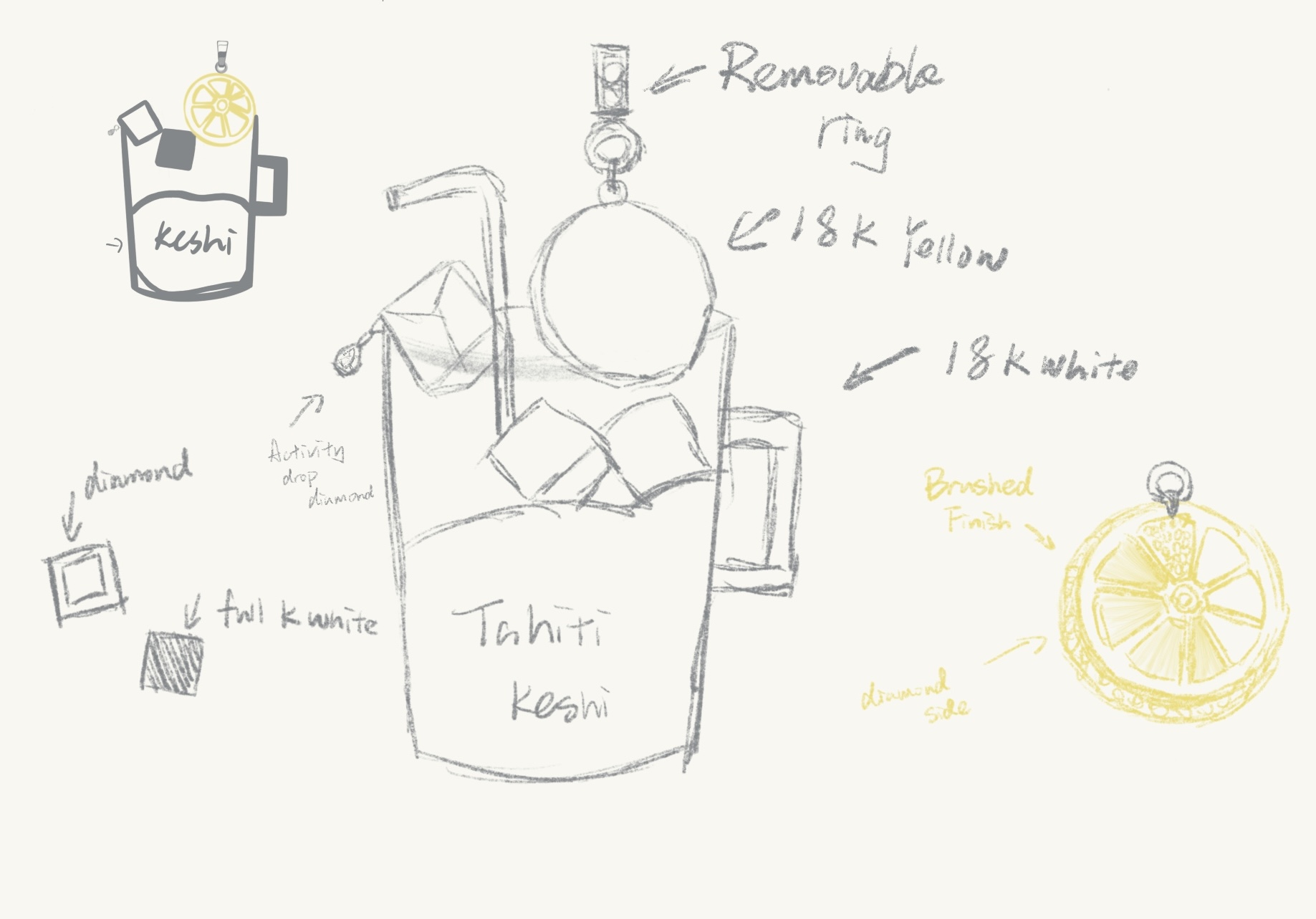
Initial hand-drawn concepts focusing on organic curves.
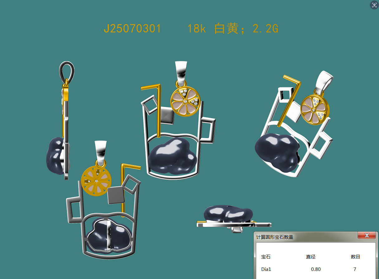
Technical 3D modeling for factory casting preparation.
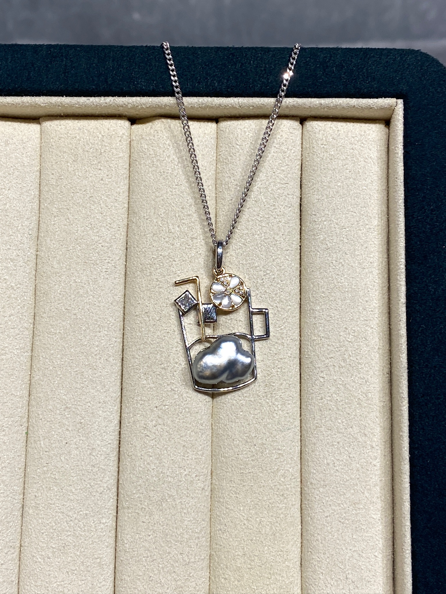
The physical manifestation of the original vision.